

History
The British came to Malaya (1) in two phases. The first phase was in the late 1700s, with the arrival of pioneers or colonizers into the country. At that point, they established the trading areas, civil service of residents, administrators, police and so on. The second phase of arrivals were consolidators in 1800; namely, law-givers, teachers, planters, mining engineers, printers, builders of roads, railways, bridges and municipal buildings etc – many of the second wave were civilians (2).
The rise of British Malaya as one of the main trading ports in Asia resulted in a plethora of printed materials: logos, advertisements and newspapers that publicised its trading industry as well as a “newfound land”. Newspapers were used to disseminate colonists’ ideologies, with foreign ads adapted to local languages and systems of symbolic exchange, and British emblems and flags were incorporated into government documents. This phase played a critical role in the emergence of modern graphic design in Malaya.
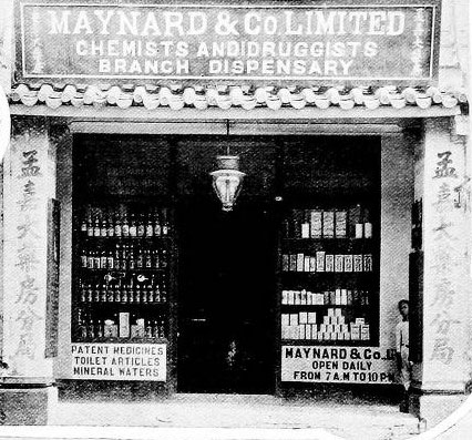 Maynard & Co, Dispensary. Singapore
The population in Malaya in late 1800 was less than 10,000. Marketing of consumer product, branding and advertising was barely considered a concept or an industry. One of the earliest forms of advertising that existed during this time was the ‘signage’. Signages are horizontal boards placed above the merchant’s shop. Its primary functions were for the purpose of identity as well as being a symbol of ownership or a marker, a signifier. Signages were also used by merchants to advertise their goods and services. They can be said to be acting as a logo or a trademark. The only and most important graphic element in the signage is the fonts or typography. The choice of fonts is the most important factor since it represents the entire embodiment of the business. In the selection of fonts, consideration is placed on its character choice – serifs or san serifs, which typeface used to persuade and attract potential purchasers as well as to capture the personality of its products.
These signages not only act as a historical component of a larger context – where it is located and its functions – but also creates a visual impression on the development of graphic design in Malaya. These artefacts should not merely be viewed as an instrument for conveying words and sentences, but critically, as representatives of the particular period when it was created and the aesthetics of those who created it (3).
Symbols of Location
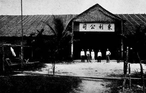
Location often contributed to the value of a store and business. Location was also a symbol of status and importance. Singapore and Penang with its strategic location attract exclusive businessmen with specialized technical skills and interests, like importers of musical instruments, watchmakers and photographers. For the locals, music was a luxury and photography as a hobby was rare. As such, these enterprises were indisputably targeted to the colonists. At that period, there was a marked increase in chemists and dispensaries in Penang, rubber estates and manufacturing goods were scattered across the country.
Man & Co: Male Only Trademarks
Socio-cultural environments in Malaya are also reflected in these signages. By taking a closer look at the signages, it is clearly demonstrated that merchants and traders in the 1800s were predominantly male: All signages during this period displayed clearly male-gendered names. From English names like Zachariah & Co, to the male Chinese, Leong Cheong & Co, as well as the male Arab / Malay, Burhan & Co. Strong masculine typefaces were used, acting as a graphic commentator. They stand proud and strong representing their owners. This male-dominated industry are mostly English-owned, with very few being locally owned.
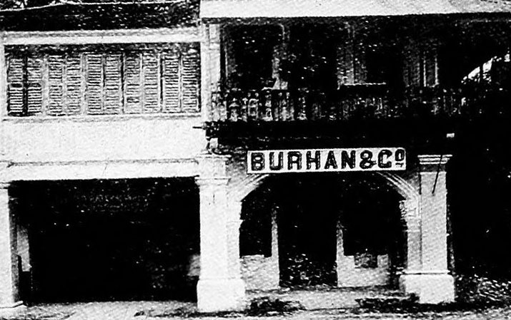 Burhan & Co, Merchant. Kampar
The absence of female names on these signages indicated the role and the place of women during this period. As Malaya was used as a central trading port mainly for the Dutch and French, ads in newspapers were targeted to predominantly men. On the other hand, ads in magazines and hotels that advertised consumable products and travels were mostly targeted to women, notably the wives of colonists and traders. This indicated two levels of gender inequality. Firstly, that women were only visible and recognised to be of value when it is appended to the productive role of their spouses. Secondly, despite the fact that local women were active in the industries of handicraft, textile, fishery, home and agriculture, their roles were not deemed substantial and important enough to grace signages or to own businesses. Women in this era were cultural backdrops with invisible faces, and have no overt or formal historical documentation.
Language and Typography
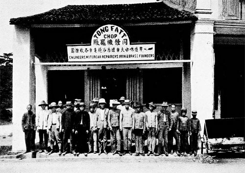 Tong Fatt Chop & Co. Perak
Typography on signages during this period can be categorised into mainly 3 categories: Cursive, Calligraphy and Modern serifs and san-serif typeface. British merchants, with their English style font consisting of modern minimal serifs or san serifs, used their own names as a symbol for their businesses. Chinese merchants include roman and Chinese language/calligraphy in their signages. The dual languages gave them room to be more creative in the arrangement of typography and their signages are slightly more elaborate in its composition and use of space. Signages found with dual languages are goldsmiths, curio shops, dentists and chemists – i.e. consumer goods which attract all layers of communities.
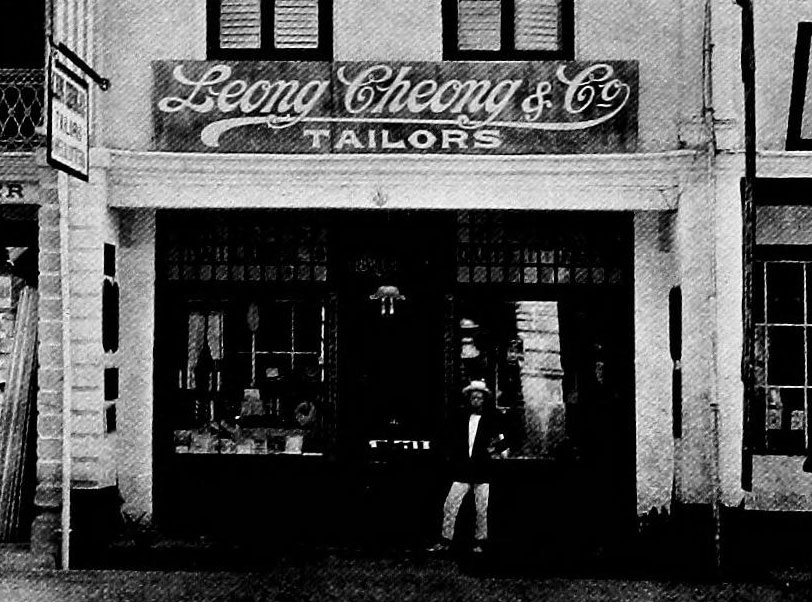 Leong Cheong & Co, Tailor. Singapore
Specialised stores illustrate their area of expertise and niche by using ornate serif typography or cursive fonts, that make it stand apart from the standard of visual symbols of businesses and trade. Leong Cheong & Co illustrated its signage with a cursive script. Coincidently, a similar typeface was created later and made famous by Cola-Cola, known as Spencerian script which was developed in 1840 and was the dominant form of formal handwriting in the United States during that period. (4)
 Eu Tong Seng, Mining.
Tin miners chose to only use one language in their signage, namely, the Chinese language/calligraphy. This is also an indicator of the historical development of the tin mining industry in the country, which began after the arrival of Chinese immigrants. By 1872, there were about 40,000 miners in Malaya, mostly Cantonese and Hakka (5). Bold and thick brushes of Chinese alphabets on its signage were designed to speak exclusively to the Chinese communities, who were the primary actors in this field.
Manufacturing goods such as brickworks with offices located in warehouses used walls as canvases for its signages.
Graphic Design in British Malaya
Movements in the economy and political shifts within the space immensely affected the development of the visual landscape in the country. As shown, one component of graphic design alone, i.e. the signage, embodies and resonates the political, economic and cultural context of this country. By examining and looking at this singular component of graphic design, the country’s economy, racial politics, as well as gendered landscape, can be unravelled. The role of graphic design as a tool for trade and commerce echoes through these images. This is the birth and beginning of graphic design in British Malaya.
Click to view the image gallery of
“British Malaya Signages of Commerce in the 1900s”
Article by Ezrena Marwan
–
References
- Malaya here refers to the British controlled states. The Malay states, locally-ruled states under British protection, divided into the Federated Malay States and the Unfederated Malay States.
- The British in Singapore and Malaya by Alex Glendinning, February 1997, http://user.itl.net/~glen/BritishinSingapore&Malaya.html
- Graphic Design History by Steven Heller and Georgette Balance, Allworth Press 2001.
- Spencerian Script – http://en.wikipedia.org/wiki/Spencerian_Script
- Tin Mining in Malaysia – http://www1.american.edu/TED/tin.htm
- All images are from “The Twentieth Century Impressions of British Malaya by Arnold Wright”

1 Comments